CASE STUDY VIEW
Building a robust interface
A deep dive into creating a robust interface that delighted our users.

Context
Best Practice is a practice management software which those in the know shorten as a PMS. Best Practice is the tool that medical practices use for everything a practice can possibly do. It's the software the receptionist has open behind their desk as well as what your practitioner is using when you go in for your consult. It's even what they use for billing you.
This piece of work was for the new greenfield's project, Titanium, which is a web-based product set to replace the legacy BP Premier. This specific area is where the receptionists work and is for booking appointments.
I led the design for this project but wasn't alone. I collaborated with other designers, developers, product managers, customers, and SME's.
Due to the product not being released yet, there was a constraint to try to remove re-work where possible and to have a quick and low cost solution.
The problem
The New Appointment modal had been built in a way that housed a simple, limited set of workflows but couldn't support the growing complexity of the product and its requirements.
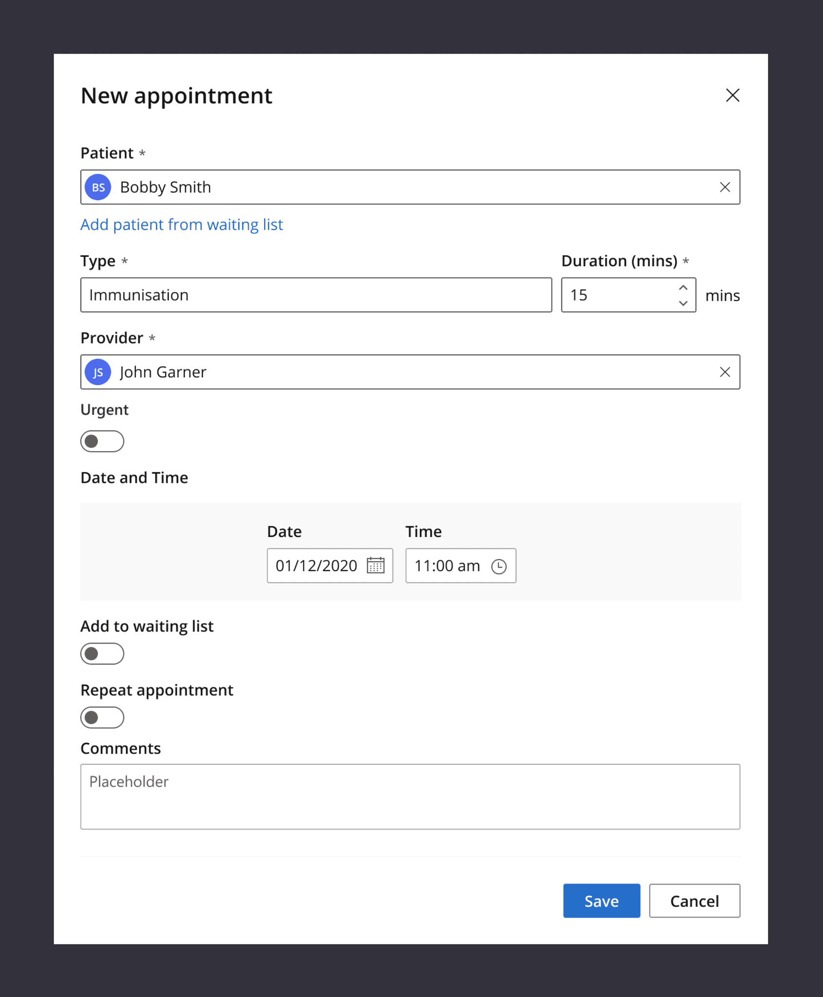
Original modal. Basic but it worked.
The existing design-pattern was negatively affecting our users as well as the product team who needed to build in this area.
Our users found the workflows confusing and were unable to easily parse the state of the appointment which was important to them.
Our product team was impacted because when a new feature or workflow needed to be added they would be severely constrained which would negatively affect the workflow.
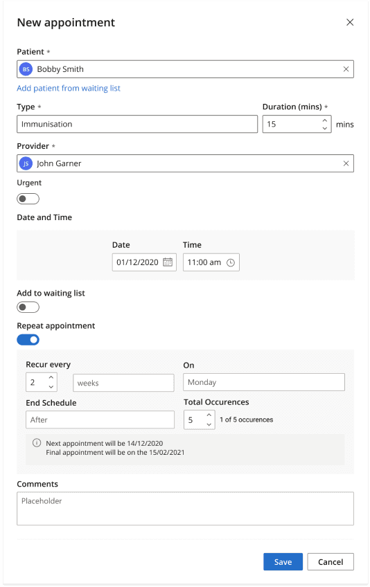
Same modal but using a complex workflow
The process
Before jumping into solutioning, a process was set-up to help improve the projects likelihood of success:
1. Clear agreement on the goal of the design
2. Analyse the existing solution
3. Look ahead: What else is planned
4. Design
Clear agreement on the goal of the design
It was important to get an agreement from the team on what the goal of the design was. This helped the team focus on the problem and not jump to solutions right away.
To do this we reached out to our SME’s and our customers and sought feedback to understand what was important to them when doing these workflows. The feedback was summarised as:
- Be able to at-a-glance see the state of the appointment
- Feel light-weight for everyday use but powerful for complex use
Those two things became our success metrics. At the end of the project we would measure to see if our users were able to see the state of the appointment “at-a-glance” and if they were they able to do so whilst still being able to do complex workflows.
For our internal team we also had a goal. We wanted to have a robust enough design-pattern so that we would be able to slot in new workflows seamlessly without other existing workflows being affected.
Now the goal of the design was clear, it was time to look at why that currently wasn't possible.
Analyse the existing solution
I needed to analyse what in the current design prevented our users from achieving their goals so that we would know what to fix and to not repeat the same mistakes as before.
One of the main issues was that the advanced workflows were triggered by toggles and then would grow inline.
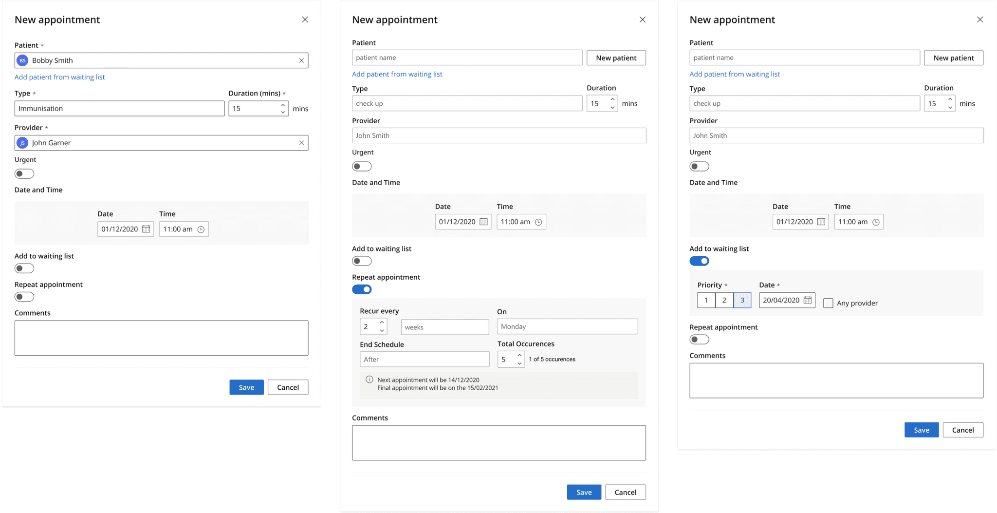
Example of different toggles activating inline workflows
This pattern caused problems because the modal would grow in height and depending on screen-size, would either create a long screen or be forced to use a vertical scroll bar. Both scenarios were bad, because the longer the screen, the harder it was to comprehend everything. And if you needed to scroll you simply couldn’t see it at all.
A second major issue was that a lot of the complex workflows didn't have separate edit and view states. You can see in this example of the feature for setting up a repeat appointment. You configure the repeat but once complete, it stays in an "edit" mode and doesn't change to an easier to read "view" mode.
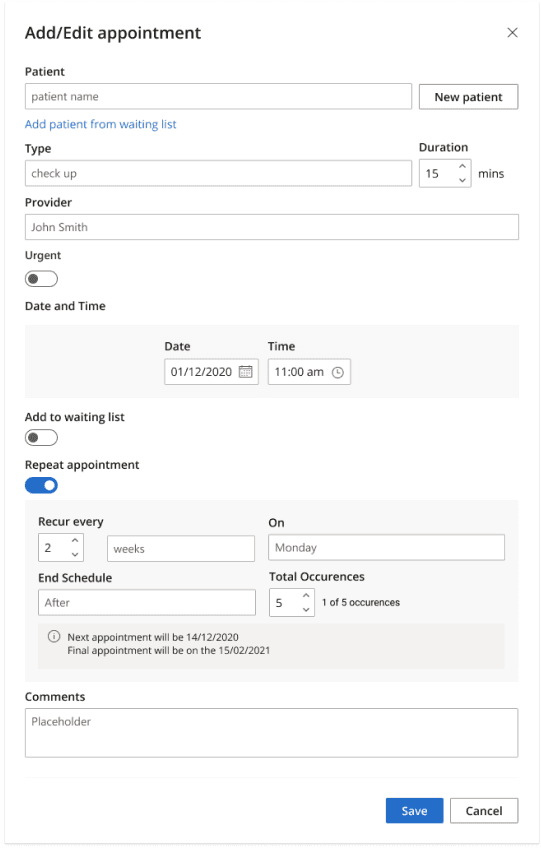
Example of different toggles activating inline workflows
From this analysis I saw a combination of things that were making it impossible to be able to "at-a-glance see what's happening" and that was mainly:
- Using an in-line pattern to house complex workflows
- Not having a separate view/edit mode for workflows
The new solution would need to fix those problems to be successful. Having this agreement before pushing pixels was important because it kept the team and stakeholders aligned. We agreed on the problem and early iterations could be looked at the right resolution and not getting caught in tiny details.
Understand the product roadmap
The reason this problem happened in the first place was because we didn’t know that there would be complex workflows needing to be contained in this UI. This lack of foresight meant we didn’t make a robust enough interface that would be able to handle new variables being thrown into the mix.
To make sure we didn’t repeat our mistakes, we needed to understand what upcoming work was to happen and what would need to be housed inside this area. Of course we can’t know everything, but this activity helped us understand how robust we needed to make the design.
Design
It was now time to start working in the design tool and look for patterns that allowed us to have complex workflows whilst being able to "at-a-glance" see the state of the appointment.
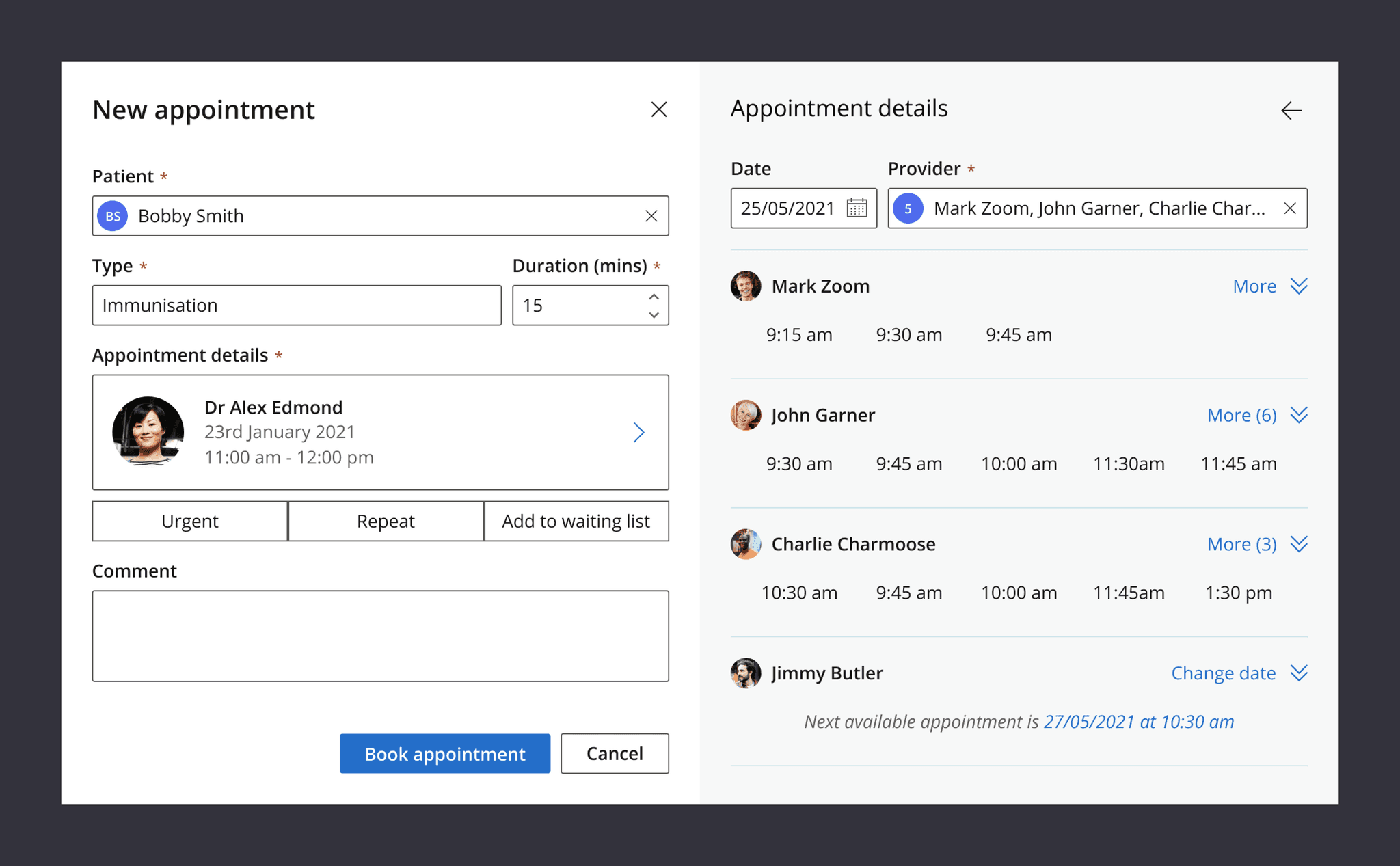
The first goal was to move the complex workflows out of the inline pattern to give them more space and to not intefere with being able to “at-a-glance” see the state of the appointment. A design-pattern that worked was creating a second panel to house complex workflows.
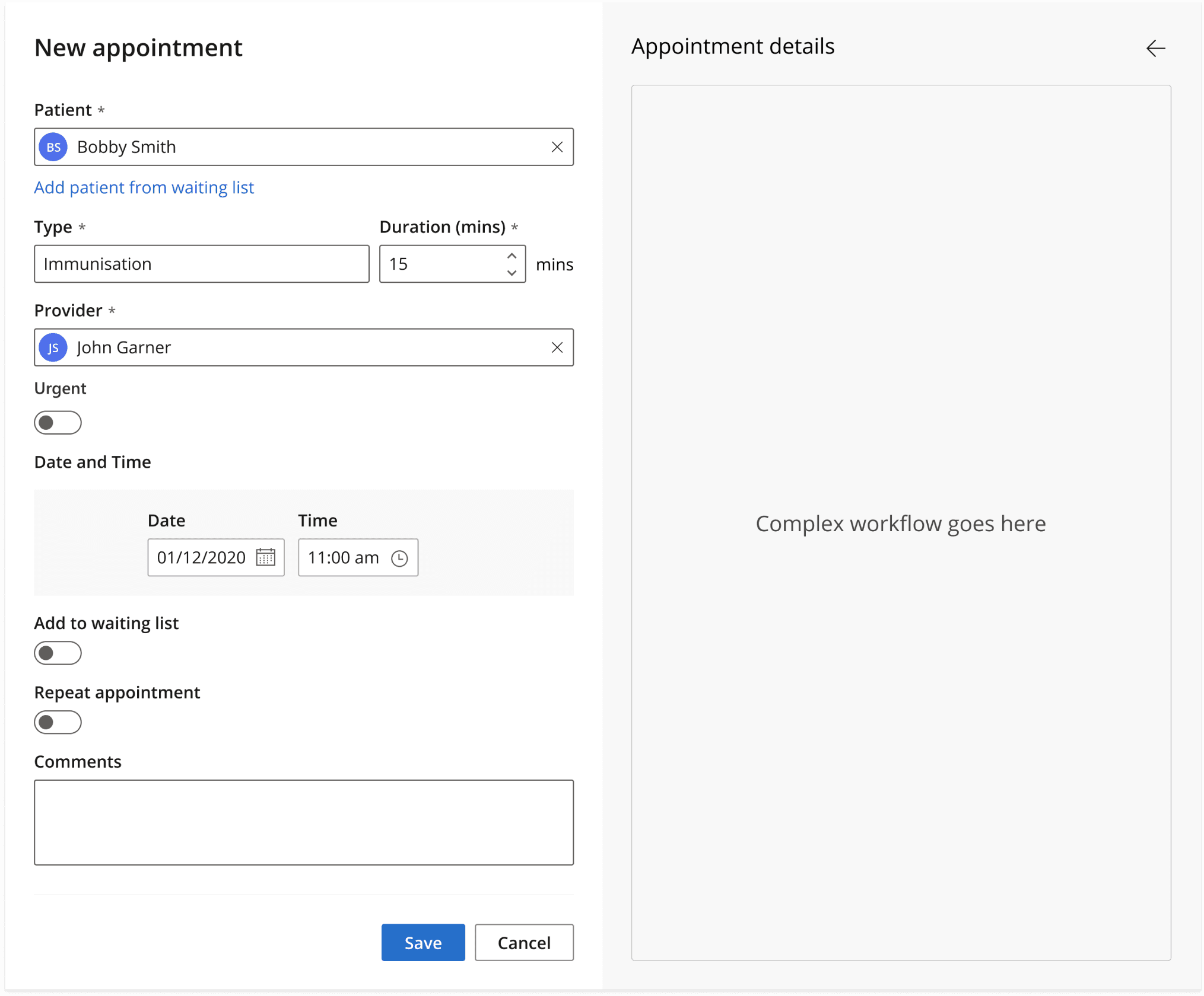
Second panel that can house complex workflows
The repeat appointment feature a was an early example and the two-panel design benefited it greatly. There was more room to fit the complex workflow meaning we were now able to show conflict reminders as well as information when the next and final appointment of a series was going to be.
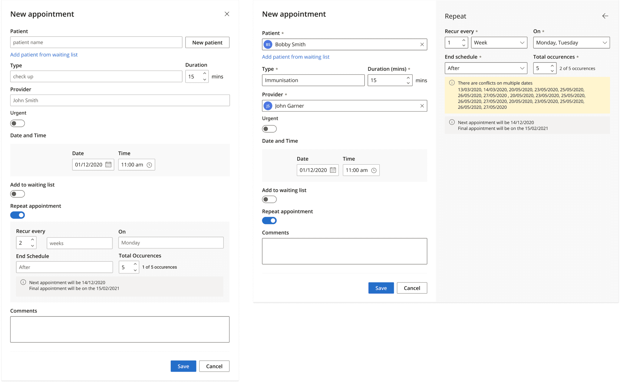
Inline vs two panel approach for repeats
The two panel pattern worked for other areas also. The Next available appointment workflow had much more room to breathe when in the second panel compared to when inline. With this additional space we were able to design this complex workflow in a less constrained way and in a way that supported the complexity of the workflow.
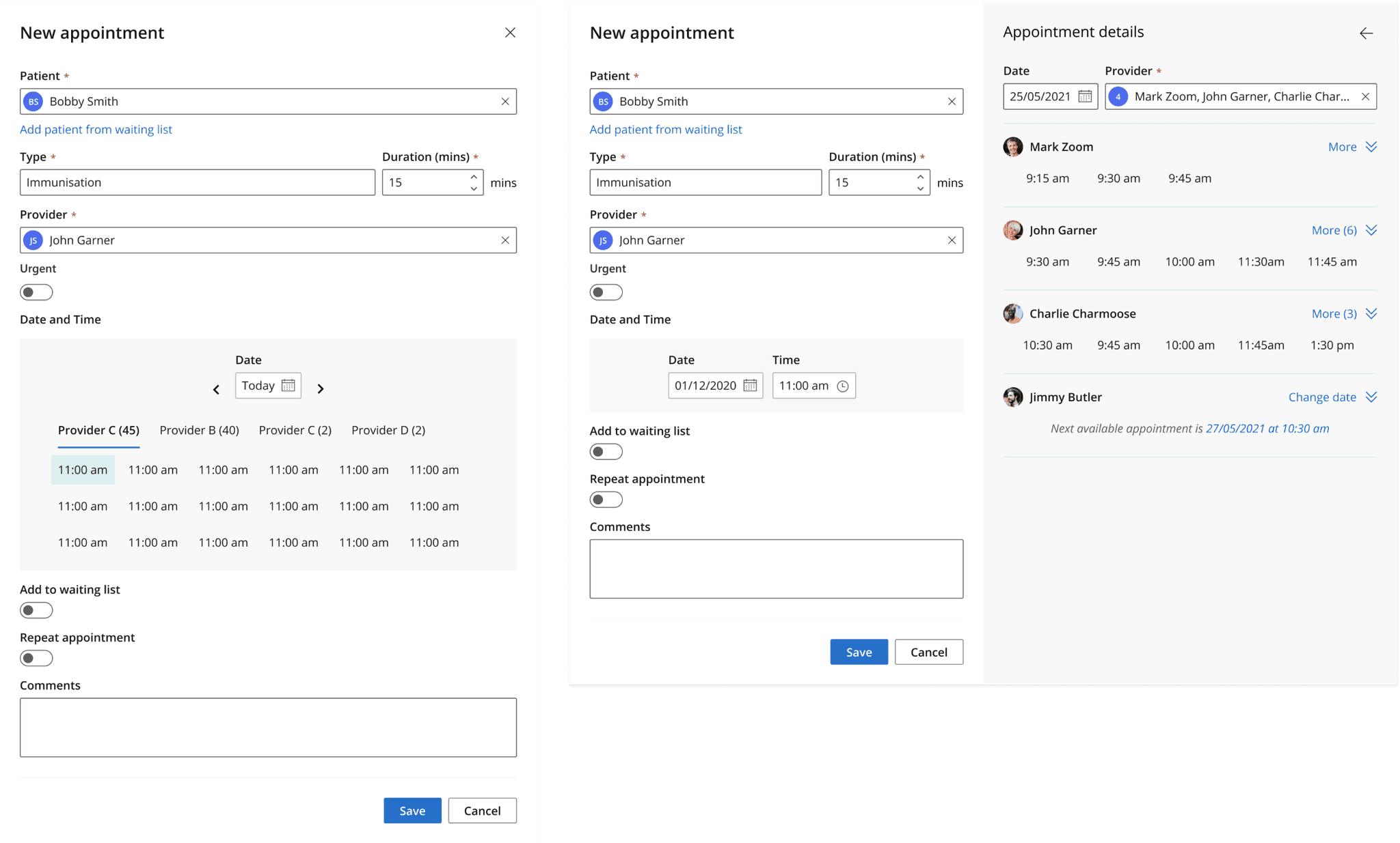
Inline vs two panel approach for next available appointment
By having the second panel for complex workflows, it meant we could focus on the left-panel for showing the state of the UI. The left panel became our “at-a-glance” view and the right panel for the complex workflows.
But the left panel had its own problems. Because the complex worklows moved to the right panel, our left panel didn’t show enough information to be able to “at-a-glance” see the state of the appointment. We needed to show information about the complex workflows and all we currently had was whether the workflow had been toggled on or off.
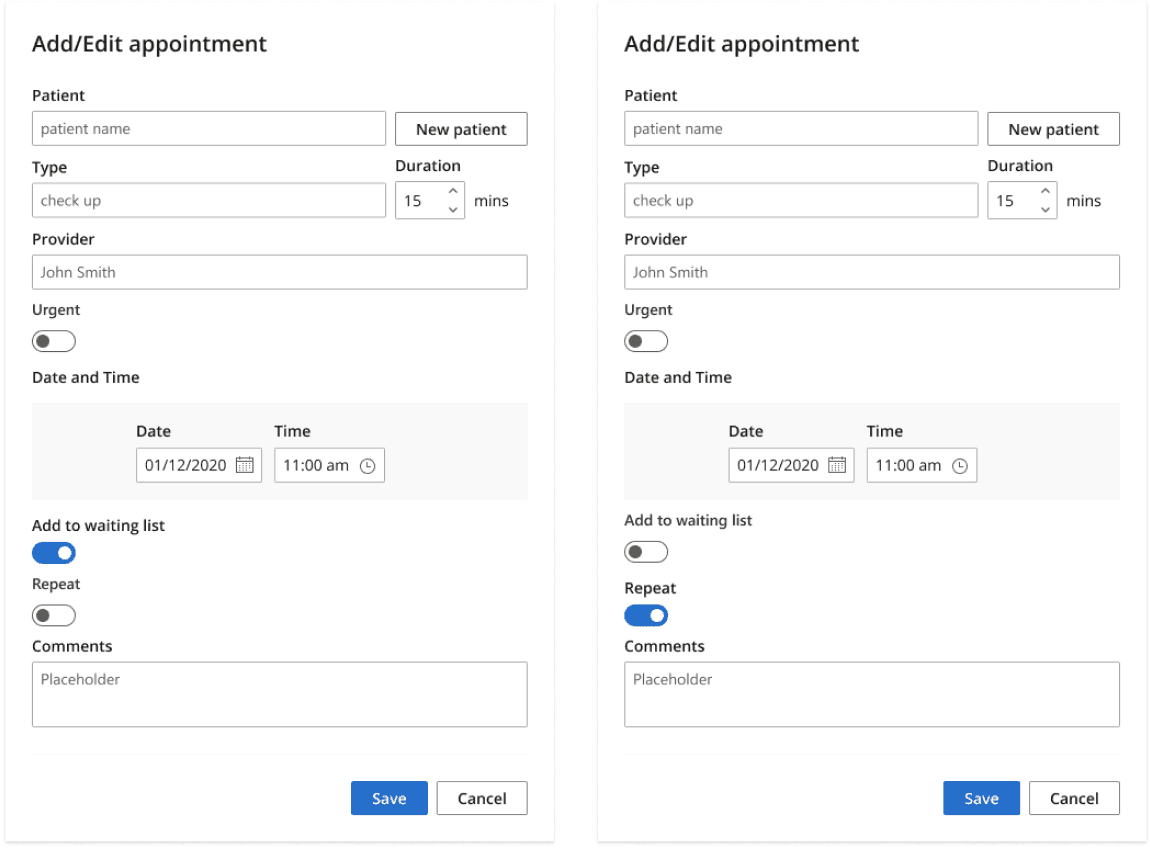
The toggle doesn’t give enough information to know at a glance what the state of the appointment is
We needed the left panel to do two things for a complex workflow:
- Start a complex workflow (what the toggle currently did)
- Give us information about the complex workflow
The way we solved this problem was to replace the toggles with what we called “expander-buttons”.
Expander buttons have two main states that are analagous to the states of on/off for a toggle but give more information than simply an on or off switch.
The button’s unselected state uses natural language to show what workflow lies behind the expander-button. And when the workflow has been completed we are able to create a clear “view” state for the completed workflow.

The expander button replacing the toggle.
It also allows us to show rich information about workflows. Like in this example with repeat appointments we can grow the size of the button and fit in information like conflicts and reminders.
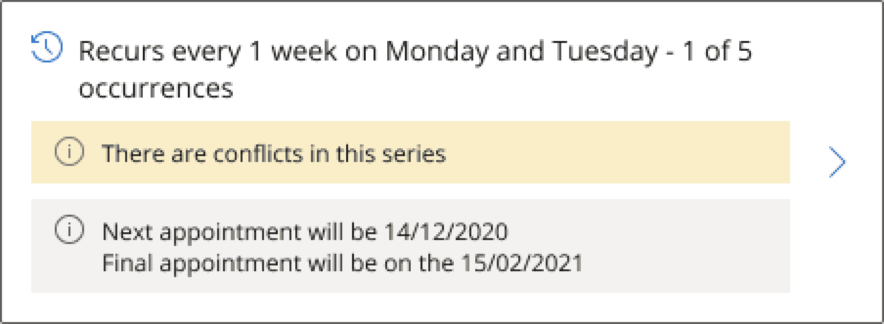
The expander button can fit richer information than a toggle.
What’s great about the expander-button is its robustness. This flexibility lets us show rich information and its pattern is workflow agnostic. It worked for all of the existing complex workflows and we are confident it will work for the unknown workflows of the future.
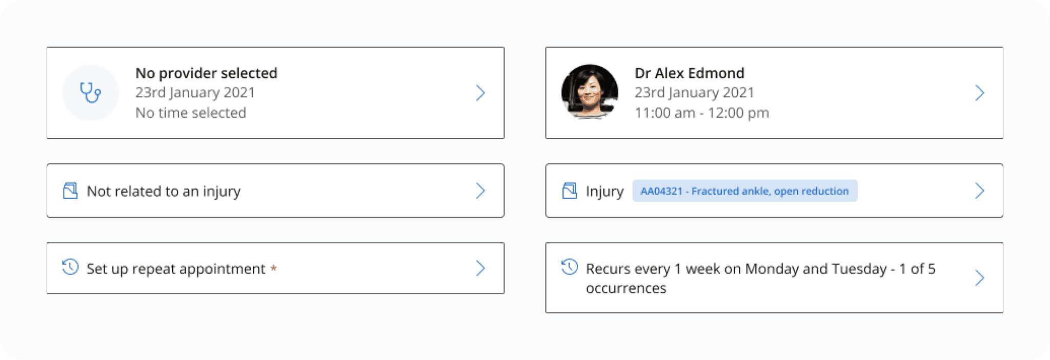
Different examples of the expander button
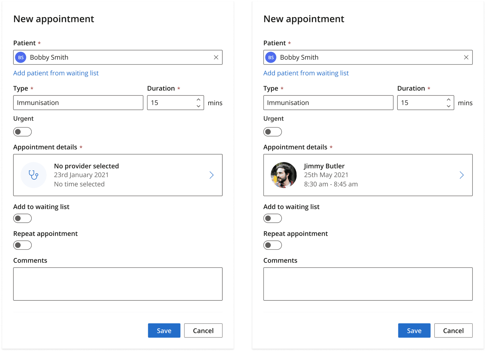
Expander button with an empty state (left) and filled state (right)
The other major problem affecting the readability of the left panel was the general design. There were lots of little tweaks to make to make it more readable. One of most effective things was knowing what things could be bundled together.
There were two main groups that could be bundled together and they were the toggles and another group that we ended up calling “Appointment details”.
The toggles of Urgent, Add to waiting list, and Repeats were all conditional. Meaning only one could be on at the one time. To represent this better and to save space, we grouped them into a component we already had in our design system and was called the “Button Group”.
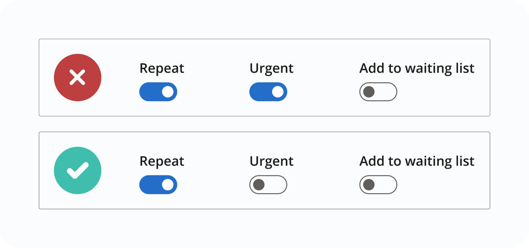
Our toggles had secret behavior unclear to our users, Only one toggle could be true at a time.

The toggles were bundled together into a component we call the “buttonGroup”.

The provider, date, and time fields could also be bundled into one group.

Moved the (mins) into the label which improved alignment.

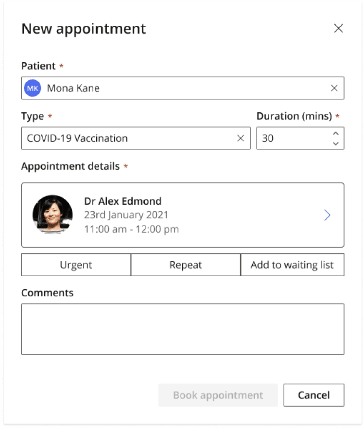
The left-panel cleaned up.
Outcome
From both a usability standpoint, and robust UI for the future, the project was a success.
Usability wise, we held a 5 person usability session with our beta user receptionists. Task completion of the workflows was successful, and there was positive feedback regarding the layout and space it provided compared to the legacy designs which were typically dense and crowded. Receptionists were able to at a glance see the state of the appointment and complete their complex workflows.
From a product perspective, the robustness of the interface via the expander-button and second-panel meant future features were able to be implemented without more re-work.
