CASE STUDY VIEW
Continuous Discovery
A deep dive into the Continuous Discovery process and how it played a pivot role in successfully shipping successful product.
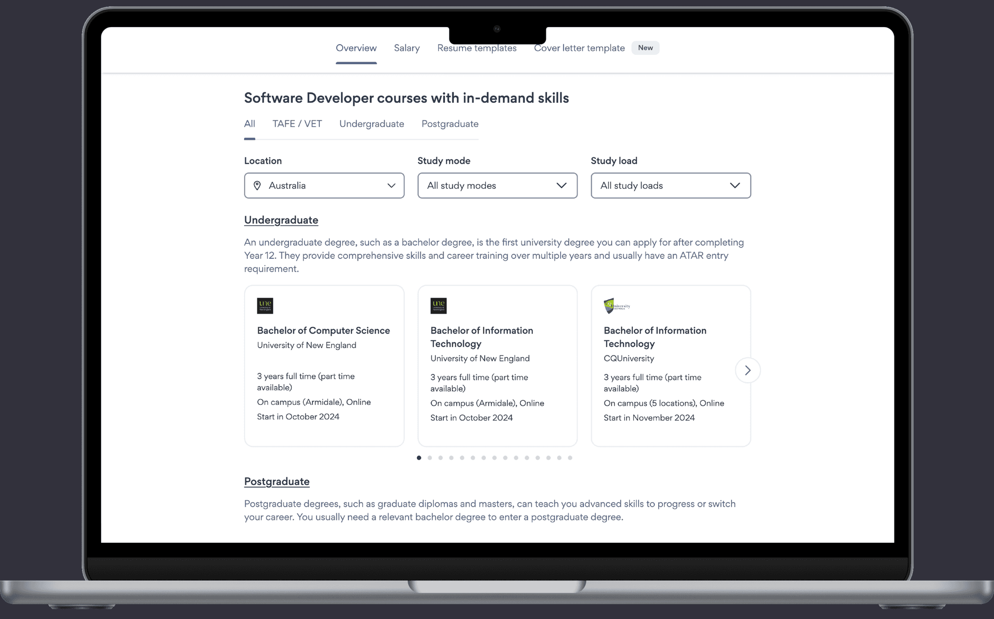
Intro
This case study looks at how I worked as part of a product trio and utilized the Continuous Discovery framework to rapidly experiment, learn, and ship a solution in a quarter that saw an 82% increase in conversion, made over $500k annually (for a 10$ million dollar business), and fulfilled our mission of enabling our users to take control of their working lives.
Context
SEEK is Australia’s largest online employment marketplace and operates throughout the Australian Pacific Region (APAC).
This work was within Career Advice which is a product and team within SEEK that aims to help candidates throughout their career journey and enable them to live more fulfilling working lives.
This is accomplished by providing insights like salary, nationwide job trends, and education pathways that can help you break into the role or progress your career.
One of our revenue streams was through our education pathways. We partner with education providers and put their courses in our product. When a candidate submits an enquiry for that course or visits their website, a "connection" is made and we are paid by the education provider.
The task
At the start of each quarter, the product and leadership teams work together to decide on the quarterly goals. We'd agreed that as part of the conversion team, our goal was to increase the candidate lifetime value by increasing the total number of education connections.
We felt this was a significant opportunity as it continually came up in our research as an important unmet need.
I was part of a product trio that included me as the design lead, a product manager, and an engineering lead. The team was rounded out with a data scientist, a content designer and another engineer in the squad.
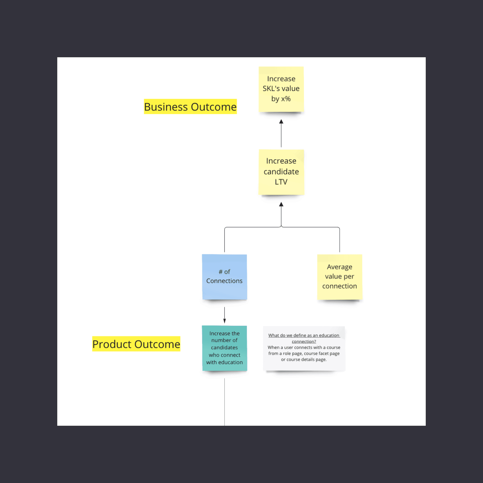
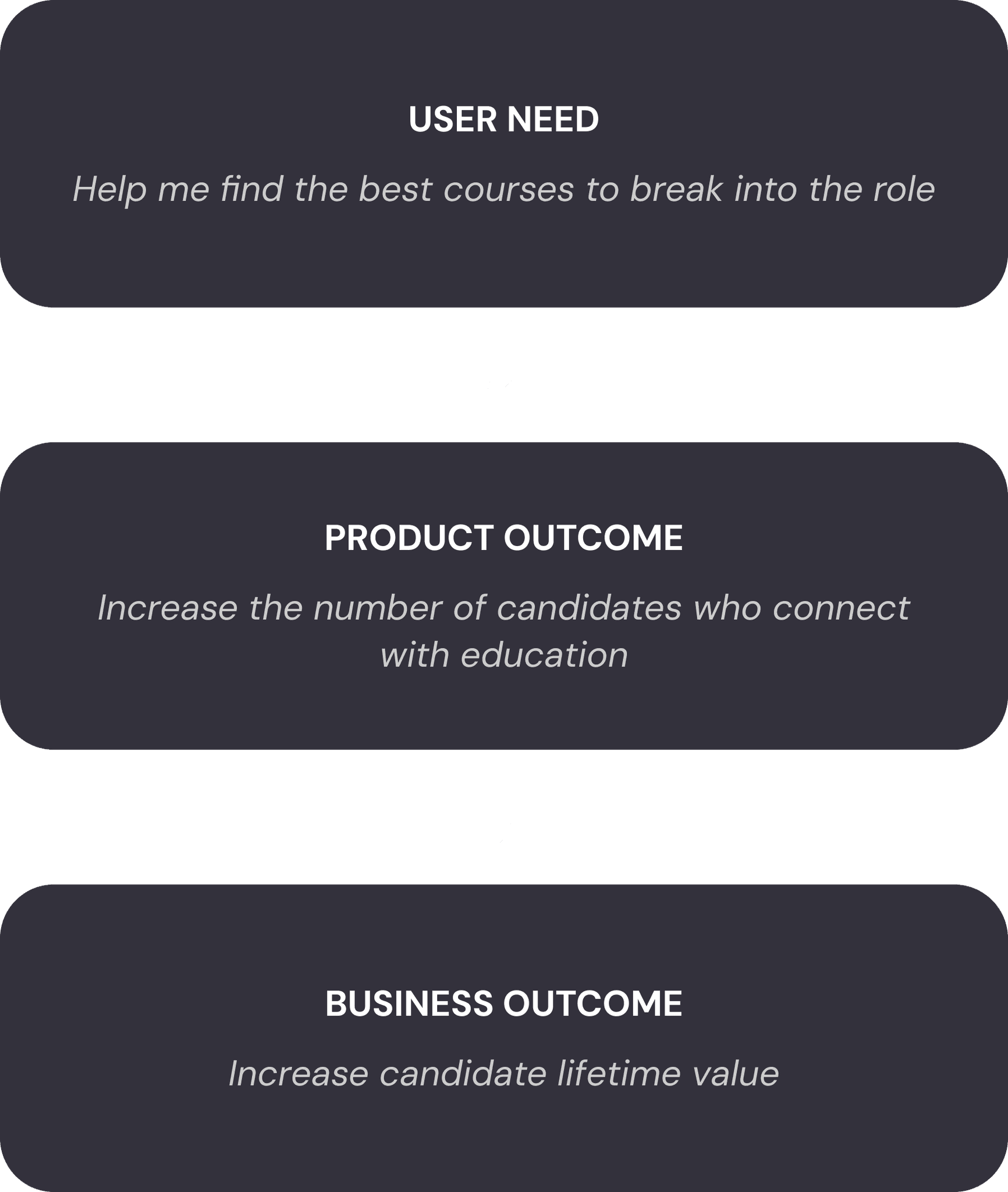
How increasing the number of connections increases our candidate LTV,
Reframing business outcomes into user needs
To ensure what we built was customer centric, we reframed the problem from the business language of "increase the candidates connecting with education" to a user need.
To do this, we looked to a UX artifact called an Opportunity Tree. It represents the insights and opportunities that have arisen from our user interviews and research since being in the problem space. These are written in the framing of our users and not in the language of our business outcomes.
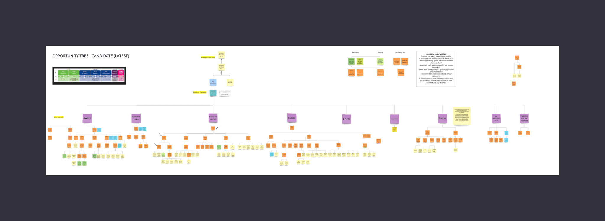
Opportunity Solution Tree of our business.
We picked the opportunity of “Help me find the best courses to break into the role” because it had been a consistent user need from our time and it hadn't been adequately solved yet.
Going forward we would now frame the problem in a user-centric way and not a business outcome way. We knew that if we could solve the user problem, we would increase the amount of connections, which would increase our conversion rate and in turn, improve our customer lifetime value.
Begin the ideation: The Solution workshop
With the opportunity now set (Help me find the best courses to break into the role), I organised and led an ideation session.
To start, each team member was tasked with writing a number of solutions down in private which we would then share as a group. They were encouraged to reference our existing research and to look externally for inspiration.
Starting with thinking in private and not as a group promotes individual thinking and gives everyone a fair voice. This increases diversity of thought and typically leads to better ideas.
After a round of presenting and sharing our initial ideas, a second round of private solutioning occurred. People were encouraged to use their teammates ideas as inspiration.
We then all voted for the solutions that we felt most confident would help our users find the best courses to break into their desired role. The three with the most votes made it through to the next stage.
Why three solutions?
Testing three ideas side by side lets you compare and contrast. This comparison provides richer insights than testing ideas in isolation and fights against shipping an unfit solution because it's the only thing the team has invested in.
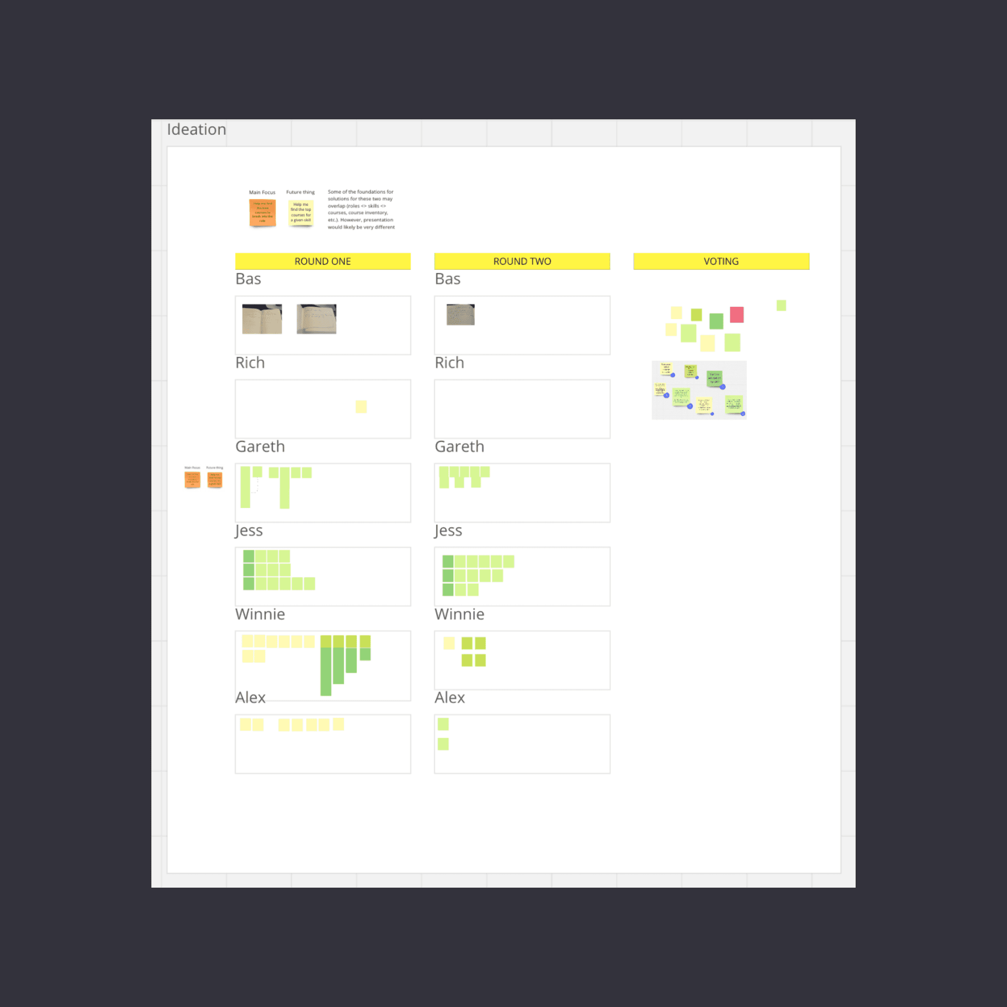
Voting for our favorite solutions.
The three solutions
Assessment module
Create an interactive assessment module to help candidates find the right course for their unique situation.
Testimonials
Add social proof in the form of testimonials to give candidates confidence about courses.
Surface education by skills
Show education options based on the skills that candidates want to
learn.
Fleshing out the solutions and ensuring team alignment
To flesh out the ideas and make sure all team members have a shared understanding of the solutions, we created a story-map for each idea.
A story map is a visualization of the sequential steps required to get to and then use the solution. Having a tangible shared artifact enabled us to have alignment as a group as we agree and understand what each step of the solution is.
Under each step of the story-map, is a list of any and all of the assumptions we can think of relevant to that step of the journey.
Assumptions are categorized as:
Usability (can people use it?)
Feasibility (can we build it?)
Viability (is this commercially viable?)
Desirability (do people want this?)
Ethically (is it ethical to build this?)
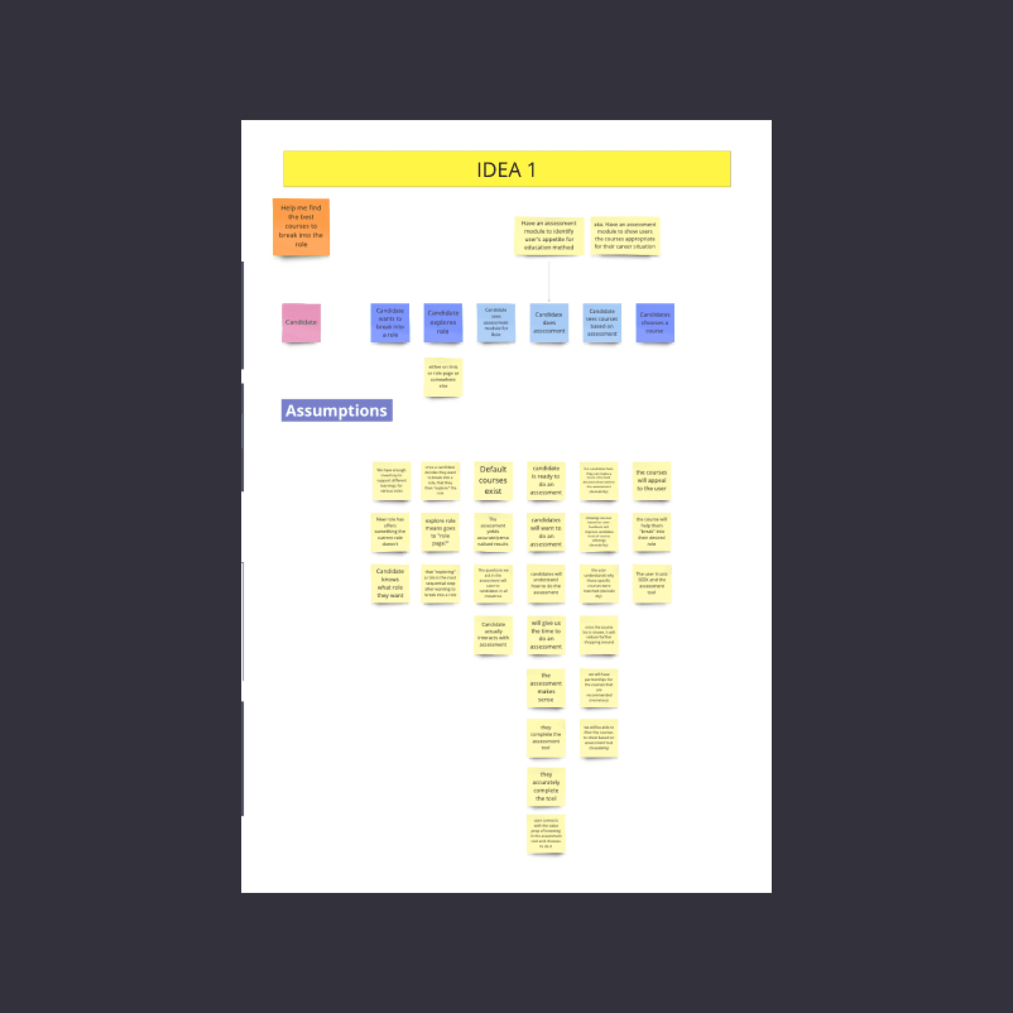
The story map and the assumptions for one of the ideas.
Assumption mapping
Testing out all of the assumptions from the previous step would take too long and run against our goal of moving fast. To improve speed and make sure we were testing the most important assumptions, we mapped them on a 2x2 grid. On one axis is evidence (strong/weak) and the other importance (high/low). The assumptions high in importance and weak in evidence would then have experiments made to test them out.
Why not just build a solution?
Achieving outcomes is hard. We didn't (and most teams don't) have the confidence that any of these solutions would drive the outcome we had set out to achieve.
By breaking down a solution into a set of steps and assumptions, we can identify the largest and riskiest of those assumptions, which we can then test and depending on the result, feel more or less confident about committing to build that solution.
This way of working is faster than committing to a solution and spending months building it only to realize it's not achieving the desired outcomes and needing to start all over again.
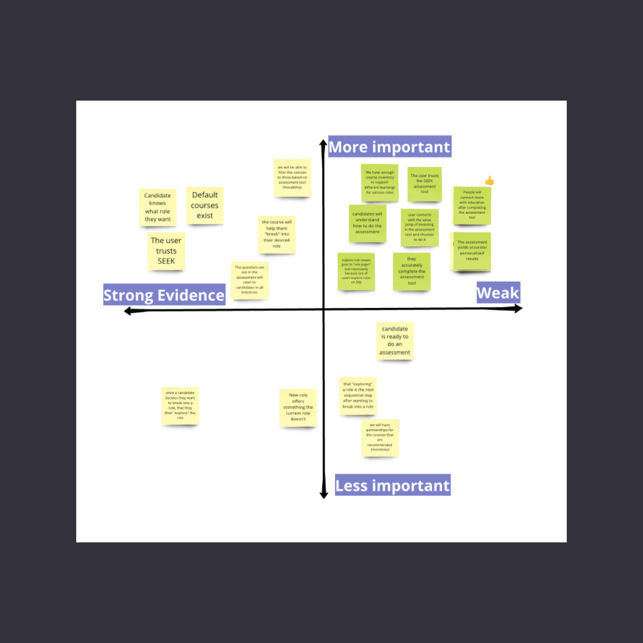
The assumption map for an idea.
Create experiments to test out assumptions
We created experiments for the assumptions we considered most important and had weak evidence for.
After testing these assumptions via experiments, we will build a better understanding of what solutions will help us achieve our desired outcome. By breaking them down into smaller chunks we can see what aspects of a solution work and what needs changing.
An example of one of the the experiments we ran was a fake-door test to test the desirability for testimonials.
What is a fake-door test?
An experiment type where one creates a simulated entry point for a non-existent feature (the "fake door").
This could be a button, link, or menu item in your existing product.
Typically when users interact with it, they're informed the feature isn't available yet.
By running a fake-door test we could see if displaying a testimonial for a course increased the click-through rate before committing to the long task of gathering testimonials from students for the thousands of courses we had on offer.
The fake-door test took less than a day to design and ship to production and only 48 hours to learn from.
Testimonials experiment: Fake door-test to test desirability
Assumption
Users are more likely to choose a course that peers have completed and rated highly
Simulate via a fake-door test
Add testimonials (from existing course or role reviews) to the existing qualifications section of a role page to see if people click on those more
Run the experiment for 2 days and will pass IF:
Click-through rate for pages where there are testimonials on the qualification are higher than CTR on pages without testimonials.
Evaluation: Failed experiment
CTR is not higher. There is no change in conversion rate.
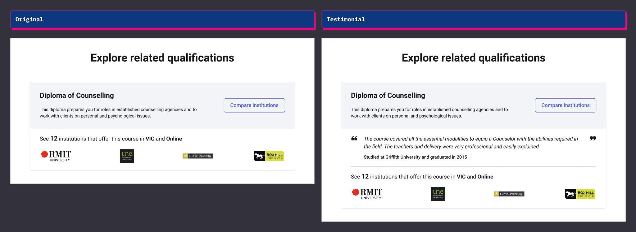
Fake-door test of the failed testimonials experiment. No improvement in conversion with a testimonial.
Based off the experiments, we had low confidence on all of the solutions
We'd run numerous experiments for each of the solutions, and the results were indicating that none of them would make a significant contribution to the outcome we had set out to achieve.
Testimonials were struggling from both a desirability and feasibility standpoint. The fake-door experiment didn't didn't drive enough click-throughs and getting testimonials from students to then map to specific courses and qualifications was going to be too expensive and time consuming for its anticipated value.
The course assessment module was struggling from both a usability and viability point of view. The friction of starting and completing an assessment meant only a small amount of high committed users would benefit from it.
Pivoting to a new solution
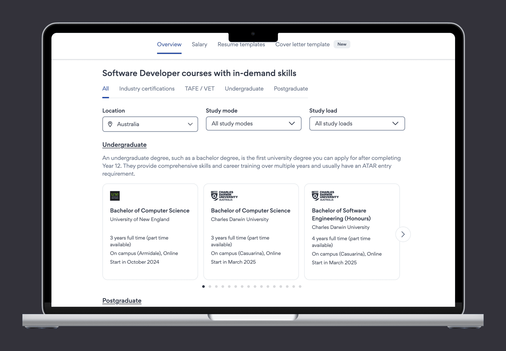
What was becoming clear from our experiments and continual user interviews was that our inventory of courses were helpful but our existing production design was letting users down. We weren't showing the full inventory of our courses in the part of the product where most of our users were.
Our bet was that if we could improve our matching so we showed more courses relevant to a career, and enable our users to find the right course for their situation, then more users would connect with an education option.
Because we had been testing fast with lightweight experiments, we had only invested a short amount of time and were able to pivot to a new solution without any pain.
The existing education design. Too few qualifications, too few courses, too few details.
Experience map and assumptions again
Within a day we had outlined the experience map, prioritized the assumptions, and created experiments to test the important, low evidence assumptions. We were working fast and ready to go.
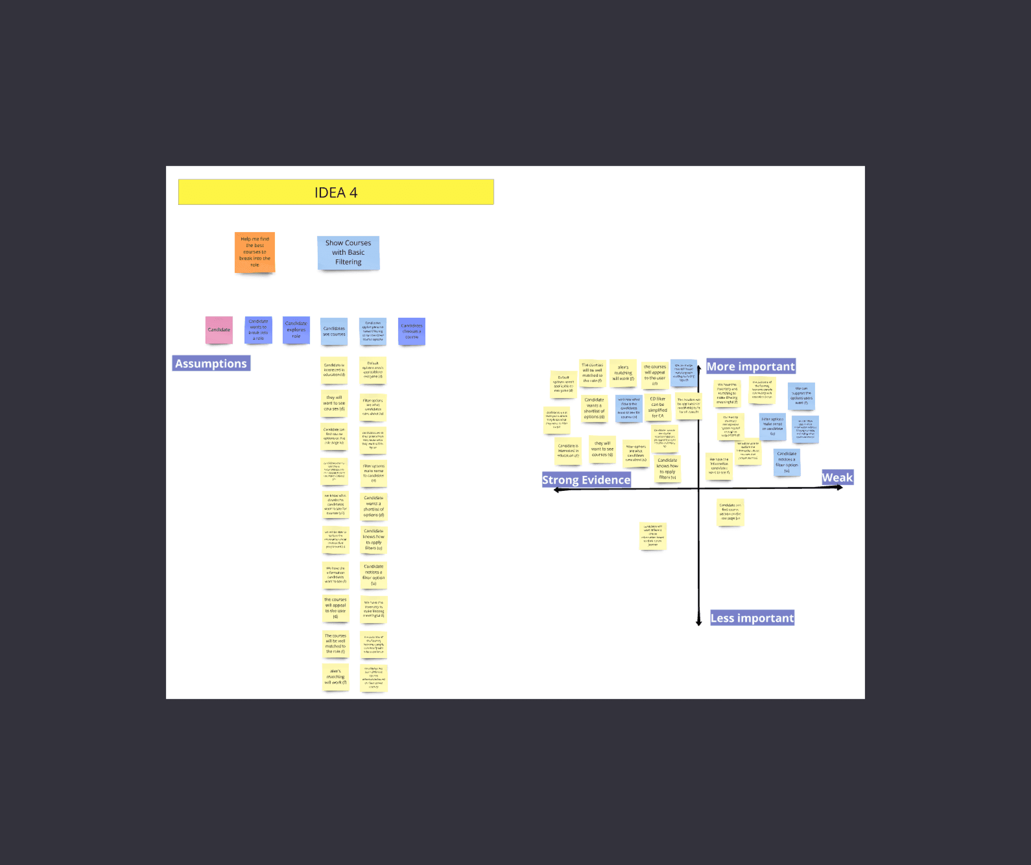
The experience map and its assumptions
Usability test to make sure people can use it
One of the experiments we ran was a prototype to test if people understood the design and how to interact with it (usability).
I sourced 5 participants who had been on our website, created an interactive prototype that was specific to each of their situations and held a session with them over Zoom.
Most of the design was clear but we removed and tweaked things that were not clear to the prototype participants.
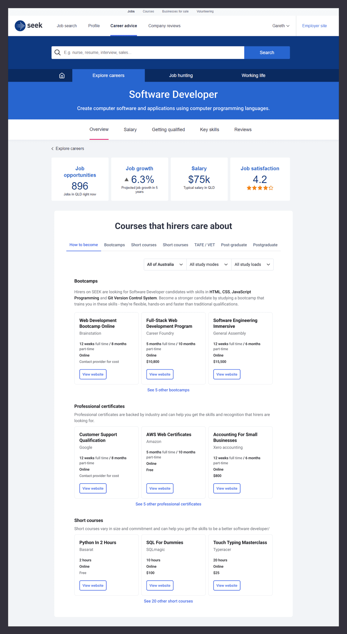
Prototype design that participants engaged with.
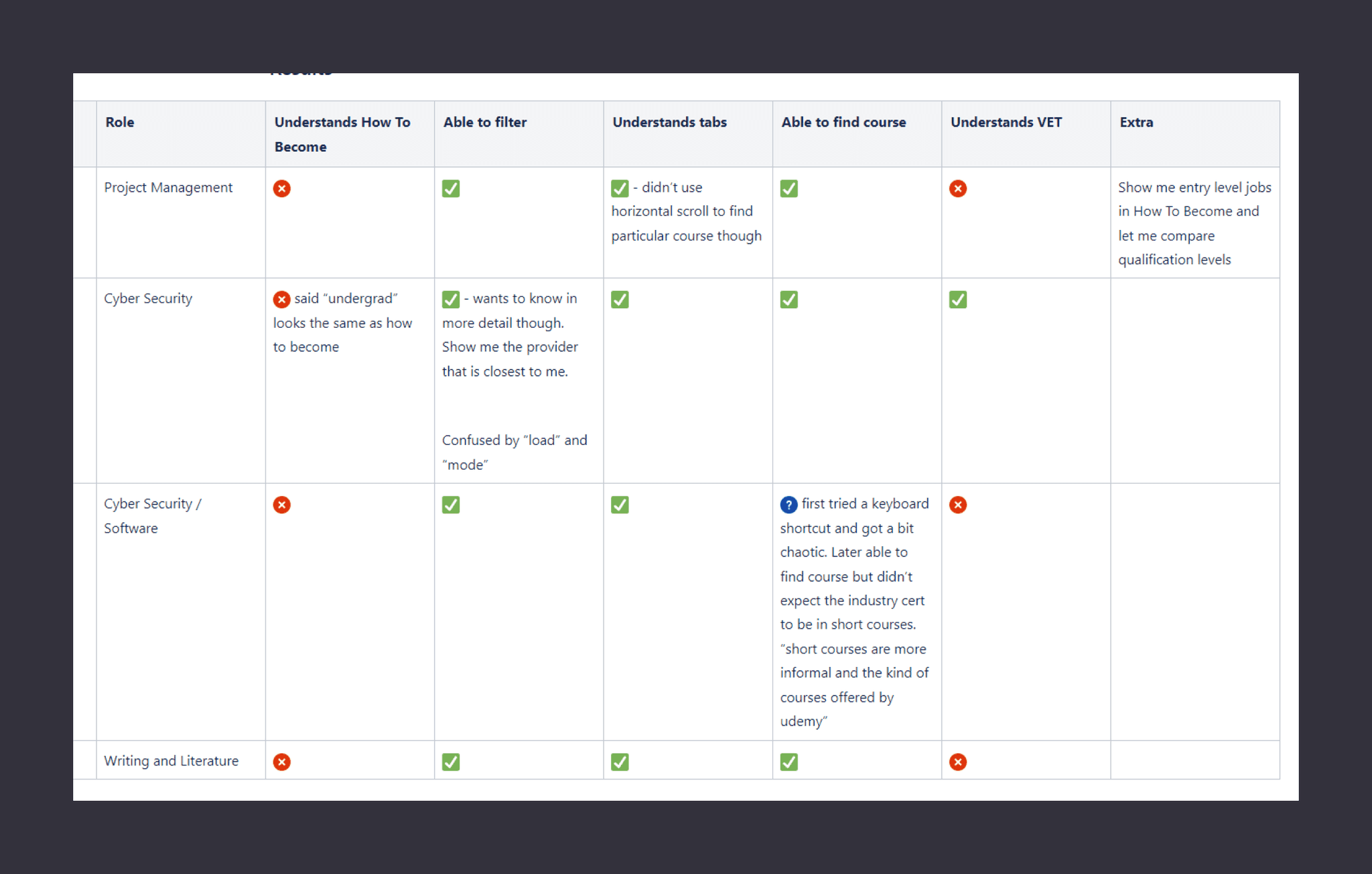
Results of the prototype.
Release an MVP and the impact isn't what we were hoping for
Over the next couple weeks we set out to build an MVP. A full scaled solution would take a lot of time due to the complexity of mapping what kinds of courses are related to a career and there were still many things to learn. We wanted to release a quicker and cheaper version to see what we got right and what we didn't. If we could see the intended impact from the MVP, we would have the confidence to invest more time and effort in scaling the release.
For the MVP we released to only the top 50 career pages based on traffic. This drastically reduced our time to release and expedited our learning compared to the 3000+ career pages we would need for a full scale release.
We released the MVP but we weren't seeing the traction that we had hoped for. Initial engagement on the module was low, and so was the conversion rate for people making a connection.
We got together as a team, analysed usage and hypothesised what the reasons could be. Over the next two weeks we rapidly tested out assumptions in the form of experiments and quick releases to see if we could change the outcome.

The experiment board for the rapid testing.
Successfully identified the improvements
Of the many experiments we ran, we identified the problems holding us back from having our desired impact.
The main problems to solve were:
1) Reduce friction to find the right course
2) Reduce the time to make a connection
3) Add design details to make course cards more engaging
Reduce friction to find the right course
This insight came from seeing the low engagement on the tab component.
It was a good lesson for our team as it highlighted a drawback of learning via a prototype and the importance of being specific when thinking about assumptions and how we test them.
The prototype tested if people were able to find specific courses which each participant was easily able to do. What it didn't test was if people would go through the friction of clicking a tab to select between education options to find the right course. As a B2C product, engagement isn't guaranteed and needs to be earned. Friction, like hiding information behind tabs, can be the difference between a successful feature and an unsuccessful one.
The solution we implemented was to have the starting tab be an "All" tab that would act as a summary of all the kinds of qualifications and courses you could do, and act as a launchpad to do a deeper dive into those categories.
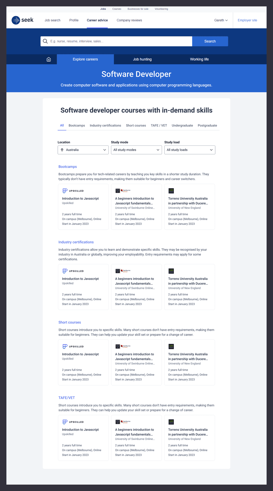
Introducing an ALL tab reduced the friction to see a variety of qualifications and courses.
Reduce the time to make a connection
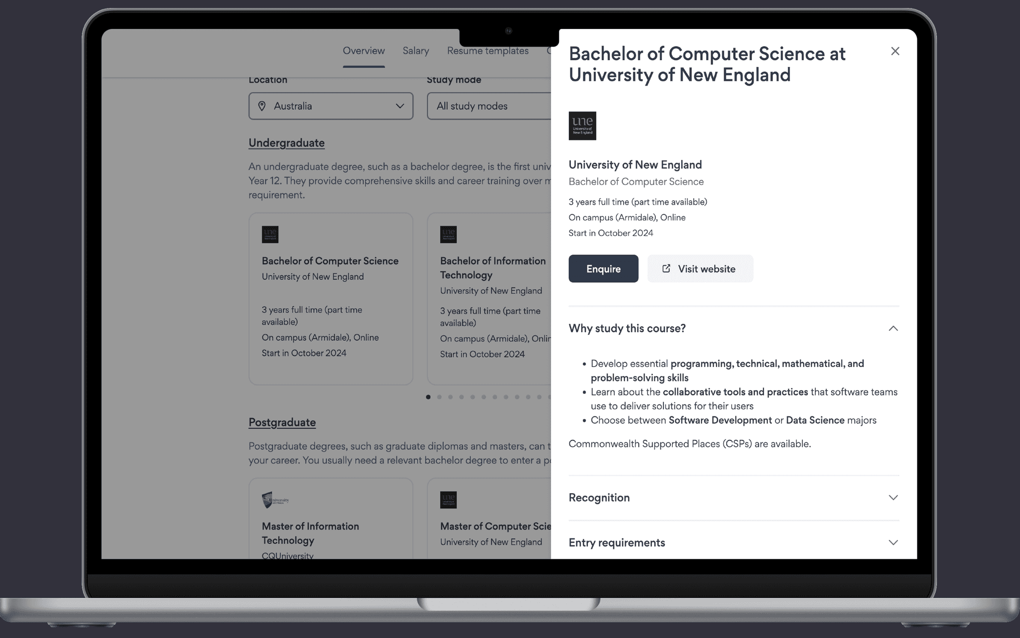
The other main problem was the time to make a connection. Due to tech-debt the way a user made a connection required long load times, even loading to a different SEEK owned product.
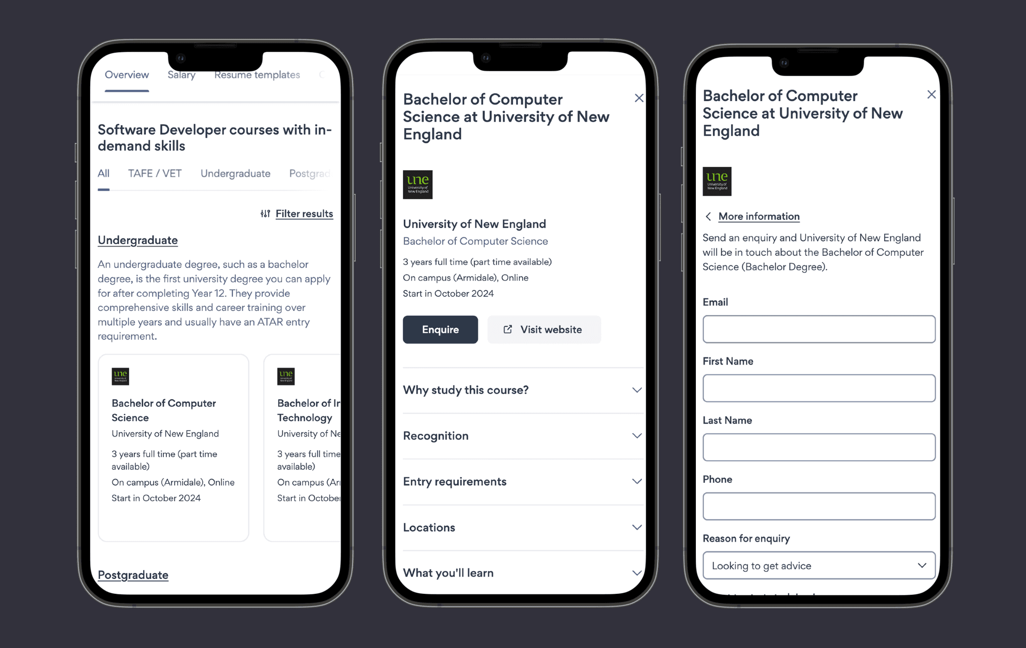
We brought that all into the one experience which reduced time, improved trust, and overall was a more cohesive experience.
The old way to make a connection.
The new way to make a connection (updated design system).
Achieve desired impact
Once those changes were implemented the metrics rapidly increased and were now confident that once scaled, we would achieve the outcomes we had set out to accomplish.
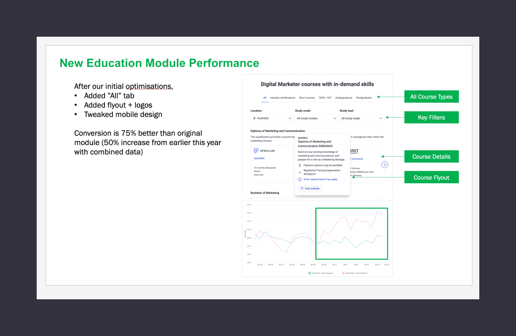
Immediate impact from making those changes.
Scale the MVP
Over the next quarter we scaled the MVP to be available to all of our users across APAC and to over 3000 careers.
Outcome
After scaling the MVP, the metrics stayed consistent to what we had anticipated resulting in us exceeding the outcomes we had set for the quarter.
By solving the user need of helping candidates find the right courses, the domino effect applied. We increased the number of candidates who made a connection, which resulted in increasing the candidate lifetime value.
We saw a huge 82% increase in conversion rate from the original module which resulted in a $500,000 increase annually.
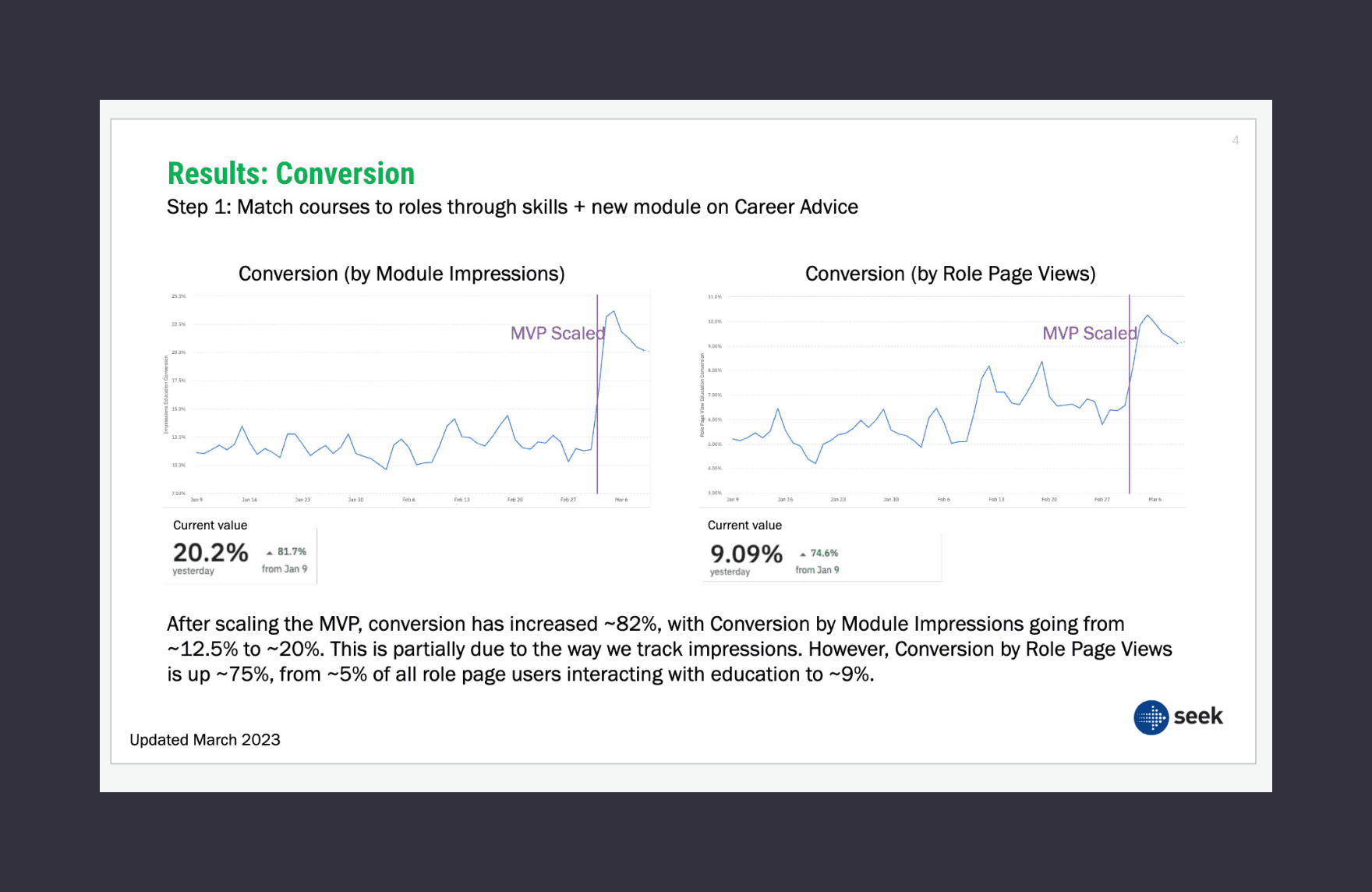
Impact post scaling the MVP.
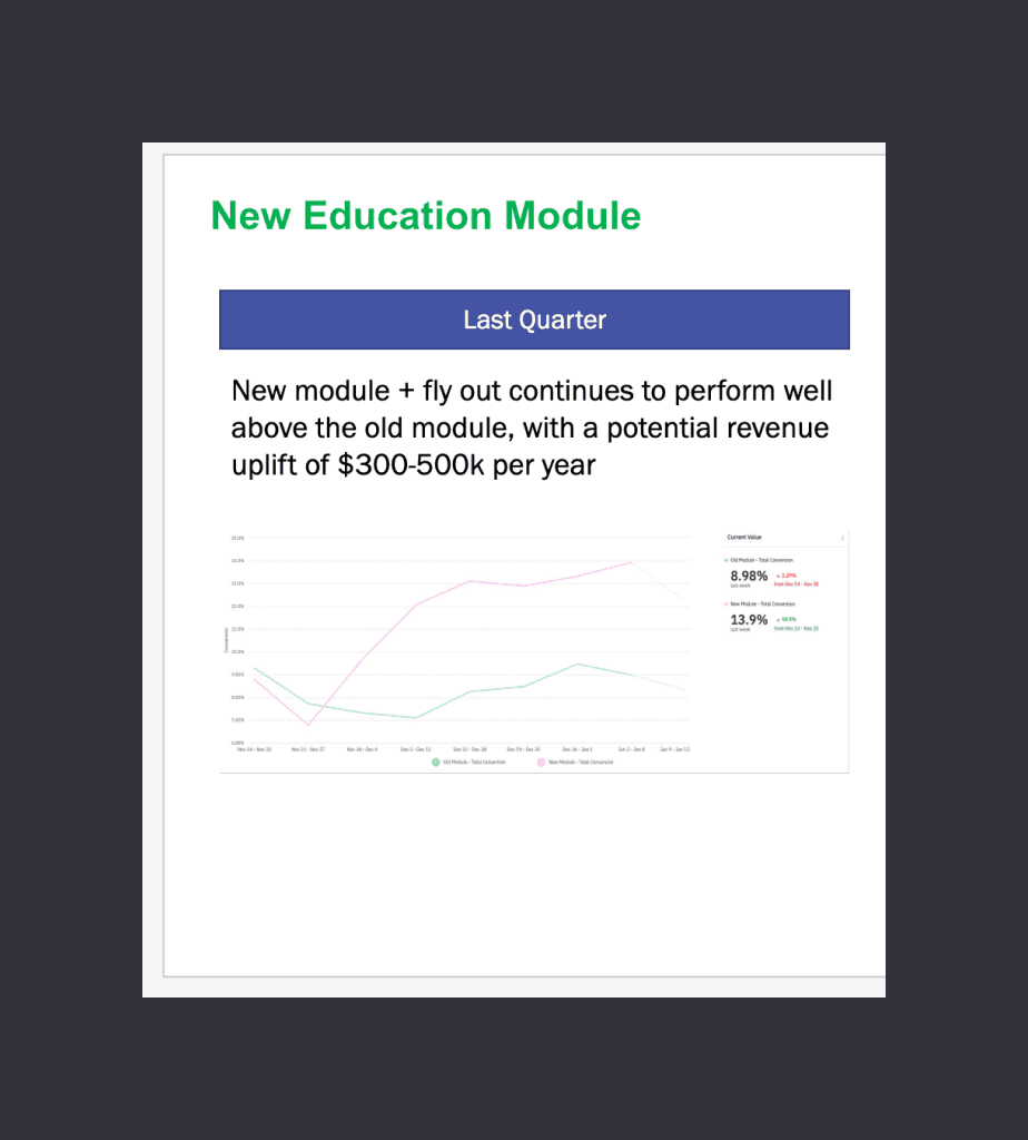
Design improvements impacting the metrics.
